Case study
Greenbox
The plant nursery that delivers.
To your door or your nervous system.
Brand Identity · Packaging · Digital and Physical Touchpoints · Visual Language
Greenbox is part online plant delivery service, part third space where plants, coffee, and music coexist. This is spec work: a brand identity concept showing what a full identity system looks like when it’s built around an experience, not just a product.

THE WORK
Discovering the refuge.
Greenbox is so much more than a plant shop. It’s relief from the city without leaving it. The concept became simple and grounding: the plant nursery that delivers. The idea applies equally to your door or your nervous system.
Designing the touchpoints.
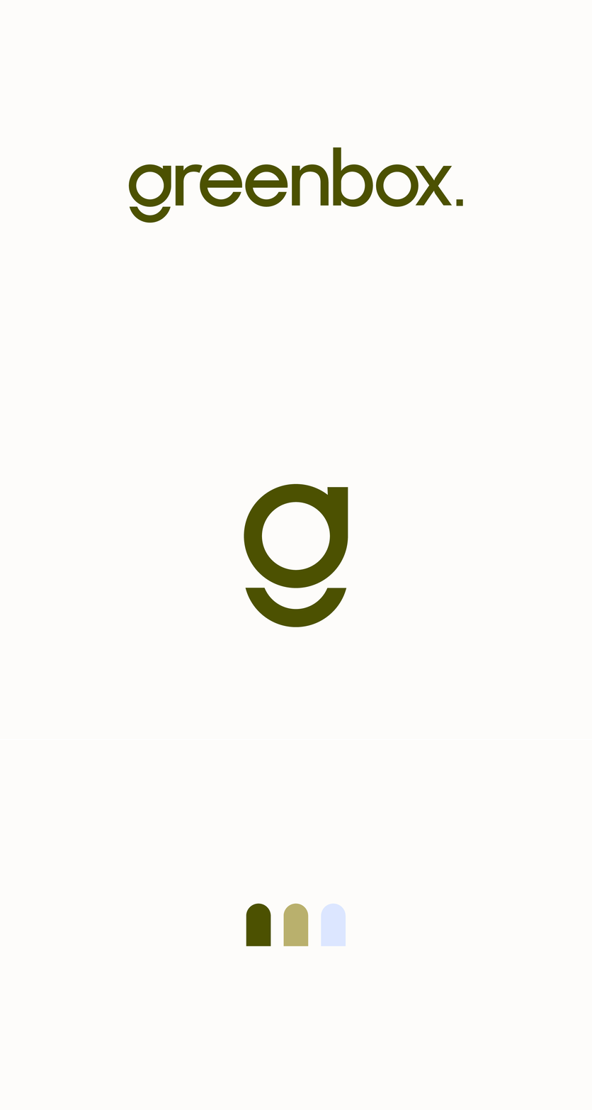
The identity centers on restraint and rhythm. Earth-toned greens, generous white space, and a bold architectural logo system give the brand understated confidence. The system flexes seamlessly between storefront, shipping box, and screen.


THE RESULTS
A local lifestyle brand for calm. The identity translates effortlessly across OOH, packaging, and digital. It's a cohesive world customers can step into or order from.

