Pretty Sites Don't Sell
2 minute read
Educational


By
Jenna Dover
Founder, JDJ Studio
Share
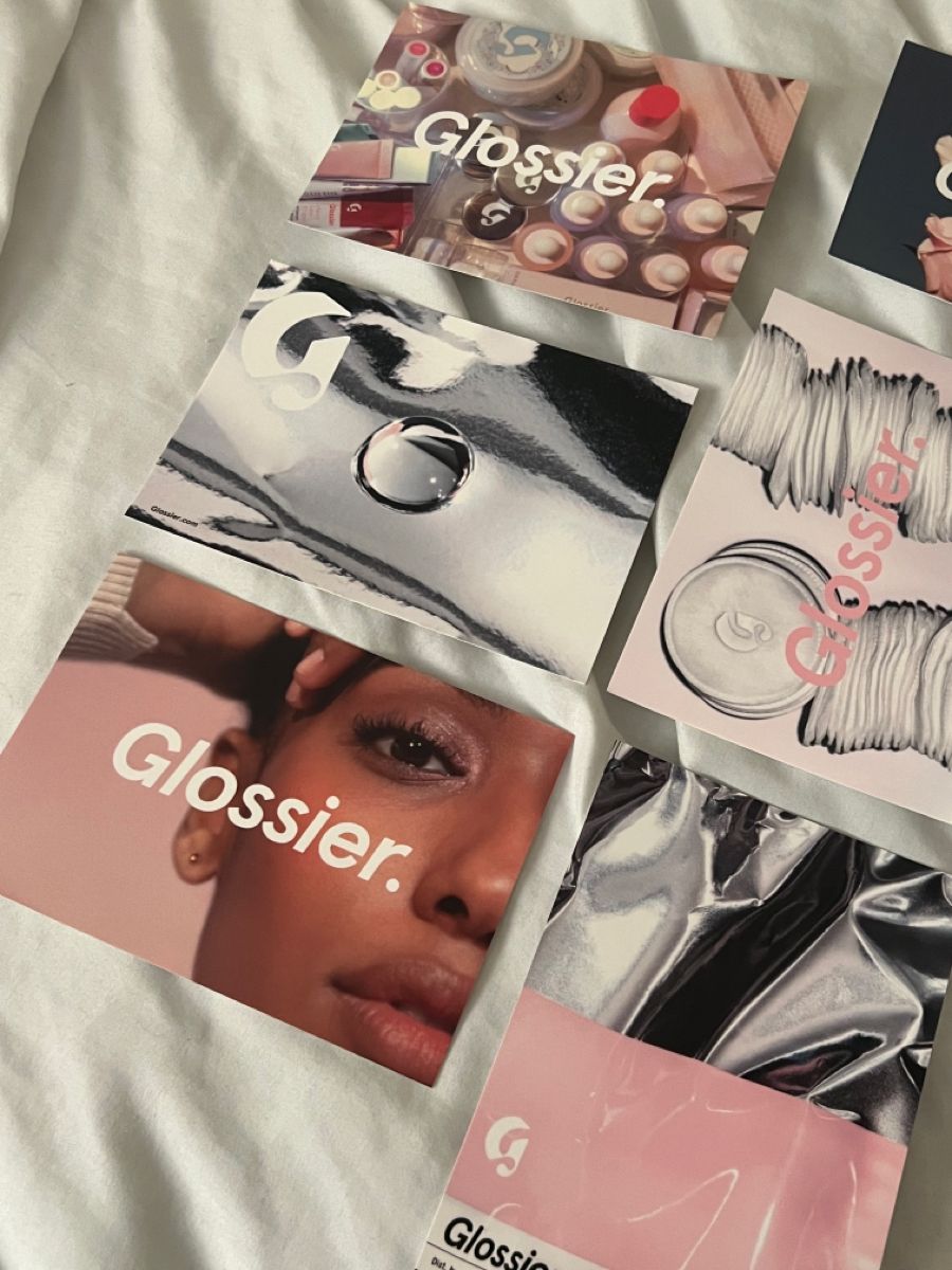
The site is gorgeous. The photography is right. The fonts are sleek.
And the conversion rate reads like a typo.
So you do what everyone does: audit the funnel. Speed up checkout. Move the reviews higher. Test a sticky cart. Each tweak buys a decimal point, and the underlying number never really moves.
Because you don't have a conversion problem. You have a conviction problem.
Friction is why people abandon what they already wanted. Conviction is whether they wanted it at all. CRO fixes the first. It cannot touch the second, and that’s usually where I see the leak.
Run this diagnosis tonight:
The five-second test.
Show a stranger your homepage for five seconds. Ask what you sell and who it's for. If they hesitate, no checkout optimization can save you.
The swap test.
Read your homepage headline. Could it sit on your closest competitor's site without anyone noticing? Then it's category wallpaper, and shoppers can't buy a category.
The why-this-one test.
Somewhere above the fold, in plain words, the answer to the only question a shopper is actually asking: why this one, and not the other tabs I have open? Not values. Not adjectives. A reason.
The pretty trap is real. Beautiful sites collect compliments, and compliments feel like progress. But nobody buys because a site is beautiful. They buy because it's instantly clear what this is, who it's for, and why it wins. Beauty earns one extra beat of attention. Clarity is what turns that beat into a sale.
Fix in this order: sentence first (what you are, who it's for), proof second, friction third. Run CRO on a site with conviction and the tweaks finally compound.
One focused month on exactly this problem is The Solve:
Explore The Solve